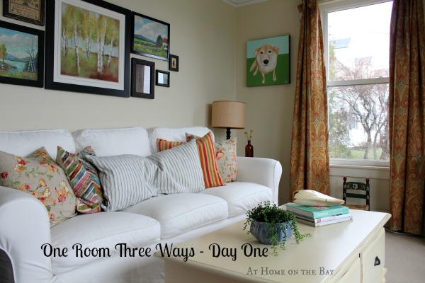
Welcome back for day two of One Room, Three Ways. On day one, I left off with my living room looking like this …
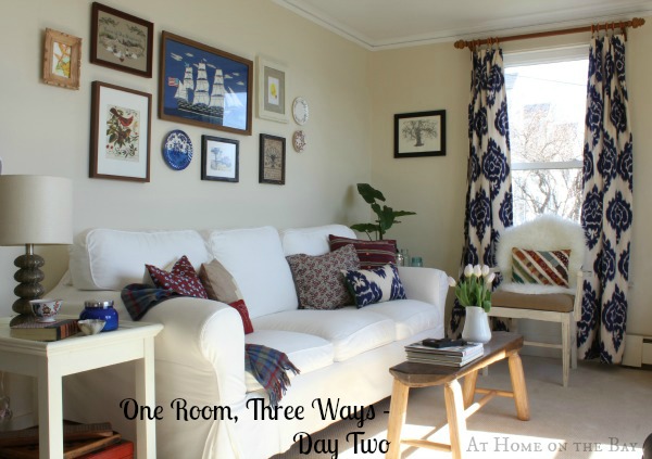
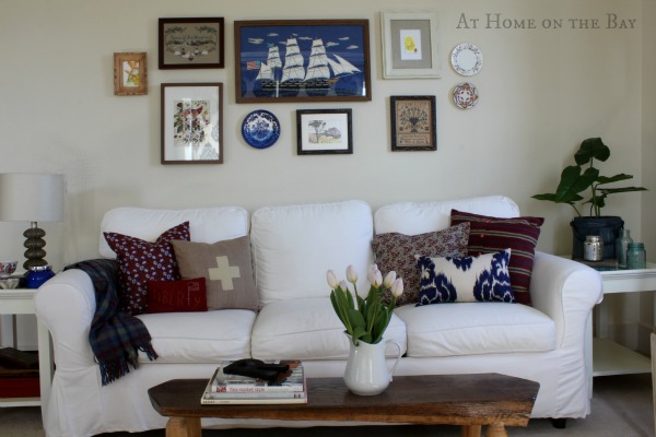
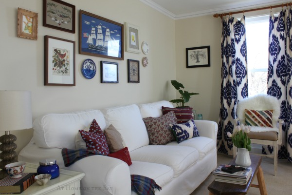
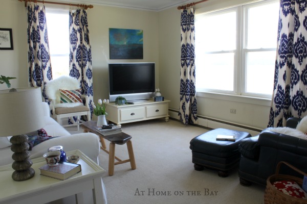
… and now it looks like this.
I wanted so much to move the sofa around, but the only other wall it would fit on was the front window wall. When I put it there, it blocked so much of the window that it didn’t look right. So, this post is for all the folks that can’t move the furniture around for one reason or another, but still want a different look.
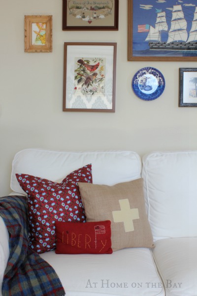
I started by taking everything out of the room except the sofa and two end tables. I shopped my house for red and navy. The pillows came from the downstairs guest bedroom and the ikat one is from our master bedroom. I also brought down a lamp from our bedroom.
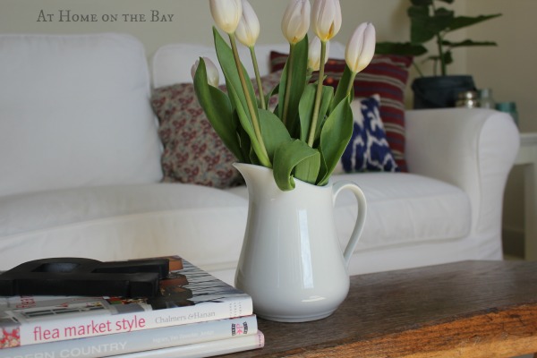
I brought in the bench from the kitchen to use as a coffee table. I spent $7 on the tulips and put them in a pitcher that I had in our dining room.
The curtains are from our bedroom too. I love how they look in both rooms. I might have to make more. Ha.
By far my favorite part of this room is the art gallery redo. I decided to mix it up a little. I brought in plates from the dining room, and miss matched framed pieces from around the house. The centerpiece blue sailboat is something that my husband’s grandmother made. I have always loved it. I’m so glad I found a home for it. I did buy one frame from Ikea for $15 to frame the bird print that I found while helping my mother go through my dad’s things after he passed away. The art gallery is so sentimental now.
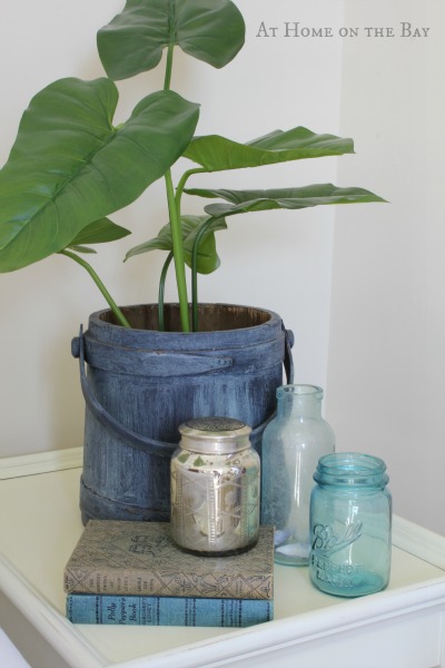
I decided to put a plant on the other side table. I love the freedom that all the asymmetry brings to the room.
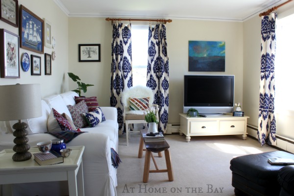
I used the white coffee table as a TV stand and above it is an old canvas that I painted over in colors I pulled from the room.
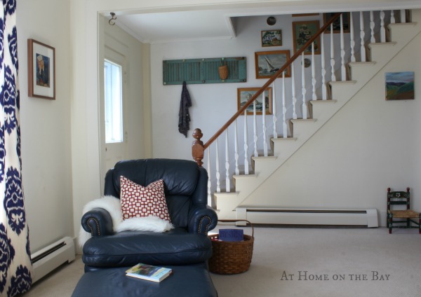
I flanked the right side of the sofa with a chair from our bedroom and brought down a navy chair and ottoman from our son’s room for the opposite side of the living room.
I can’t wait to see what these 6 talented bloggers did with their rooms on day two.
Tomorrow I’ll be back with a whole new look, and Friday is party time where you can link up your room redo.
P.S. Google Reader is going away on July 1st. You can follow me on Bloglovin by clicking below.
Did you know that transferring the blogs you follow on Goggle Reader to Bloglovin is as easy as one click? I did it and it was so easy.





Wow! What a huge difference a change in accessories made to your room! The first things my eyes zoomed in on are the sailboat art and the curtains. I’ve got lots of navy blue in our living room (couch, sofa, and chair), but it’s so much more pleasant used as an accent color. I can’t wait to see what you could possibly do to change your room out one more time!
Oh My! What a difference! I think this is fun to do especially if one has lots of accessories to choose from. I love the rustic bench for a coffee table. The colour scheme is great for summer but so is the one from the first post. I hope you had help in moving things around especially the furniture! Looking forward to #3!
Oh, I’m so happy to find your blog through The Lettered Cottage. I love your style and took a tour of your home. I even looked at a few of your DIY projects – clever!
We share a love of landscapes, so I was very interested to see how you used yours throughout the house. I have collected quite a few myself that I want to use on a wall, perhaps in our family room, up the open stairway, but my husband doesn’t like that they are not all framed in identical frames. He uses hurtful words like “mix and match” and “hodgepodge” when describing my style. 🙁 I think I can win him over! I’m not opposed to unifying the frames, but I’m not really sure how to go about it.
Thank you for your inspiration. We just moved into a house built in 1986 that is one project after another. I’ll be back!
love it like that! love the navy in the mix and the curtains! chic nautical!
I really like the blues for summer. You’d make a greater impact if you arranged the artwork differently than the before pic. Have you tried floating the sofa with a console table behind it to add height and identify an entry way of sorts ? Love love love the bench as a coffee table … Keep playing with it like I know that you will….you’ve got great bones . Hugs
Oh, you know I LOVE blue and white. This looks so good. Love those curtains.
I have to say I LOVE this version of your room…looks so soothing – great job – can’t wait to see what’s next!
Love this look – perfect for a house that sits on the bay! That little red cross pillow is fabulous – and I LOVE the gallery wall – but you know I have a weakness for those! The curtains are perfect too!!
Kelly
This is WONDERFUL!! It’s a keeper!!
Hi Mary!
I have found your fabulous blog through this challenge and I love your style! I think it is similar in my ways to my own and I look forward to following you now. I’ve added you to my bloglovin’ ! Can’t wait to see look number three!!
Krista
Oh Mary! I LOVE the blue….super cute! What a great transformation! Can’t wait to see tomorrow!
Happy day to you sweet friend!
karianne
Mary, I LOVE LOVE LOVE the blue curtains! They make such an awesome pop!!!!! The blue looks so good in there!
Very impressed with this one! Great way to show how accessory changes completely alter the look of a room.
I just love this version of your living room…so fresh and crisp for summer with a nautical feel to it. The new arrangement of your wall art is just fabulous. I love the chair in front of the window and the bench as a coffee table. This room has so much imagination and creativity poured into it…great job!
XO,
Jane
LOVE those curtains, the navy and white. I loved your room before, but these colors just brightened things up so much. I find that my plants seem to be attracting gnats, so I’m holding off watering them. You ever had that problem? I’m thinking I may just have to plan a gallery wall…
Brenda
I love the navy curtains in your living room. That fabric is gorgeous! Great job for your second look. Anxious to see the third one.
Hi Mary, What a wonderful change. I love the gallery above the sofa too. Those blue & white curtains certainly look like they were made for the room. Beautiful!
LOVING this redo! well done!
I FINALLY got on my computer tonight! I read yours posts last week on my phone but it wouldn’t let me comment so I wanted to pop in tonight and tell you what a fabulous job you did. i loved all of your rooms but I think this one is my favorite. LOVE how those draperies look in there!